Web design

Personal landing page

Project Overview
I worked on designing a personal website for an English teacher with the aim of giving potential students a sense of familiarity with the teacher, her methods, and ideas. The main goal of the website is to attract a relevant audience that will become potential students.
My Contributions
Competitor analysis
Components & Variants
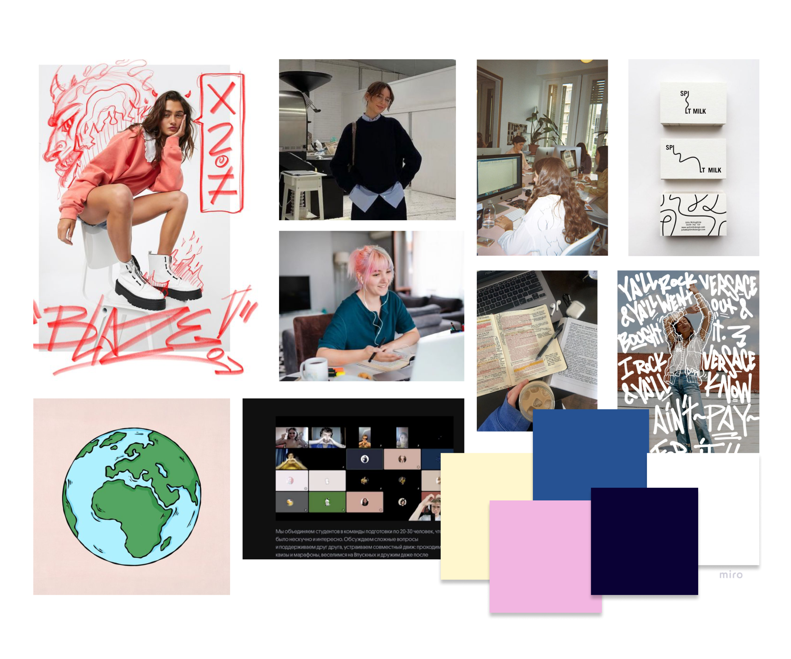
Illustrations, colors & Typography
Wireframing
Visual design and prototyping
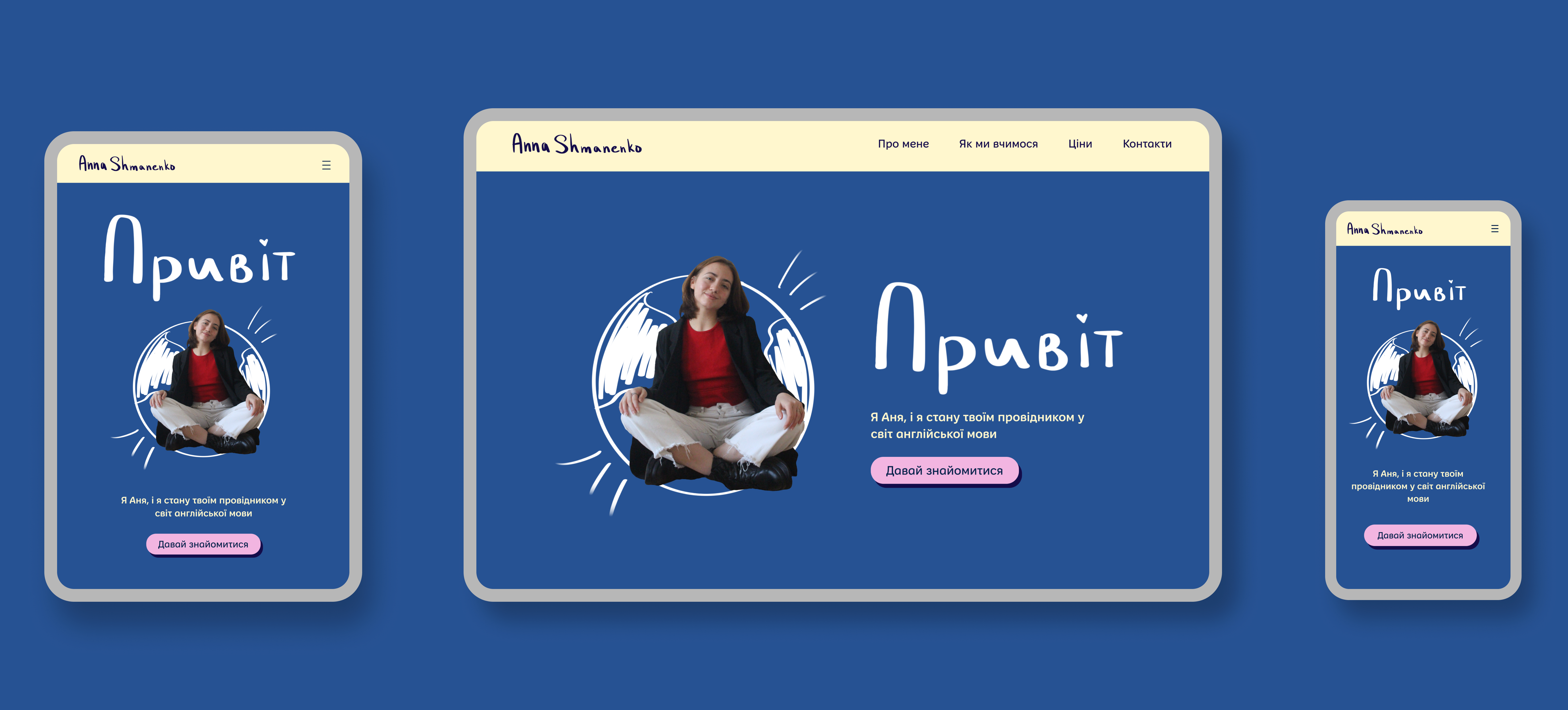
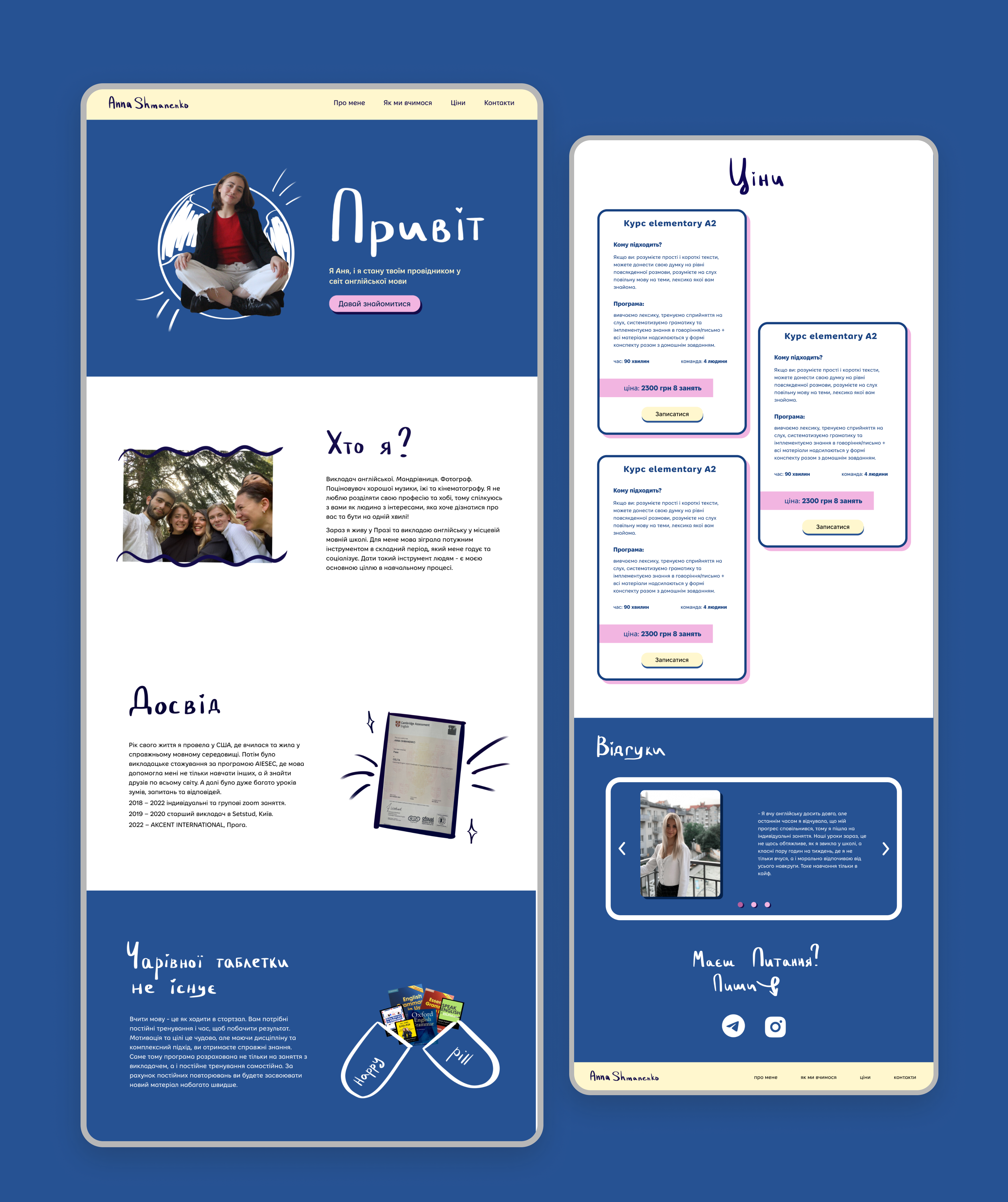
The focus in the creation of this website was to make a minimalist, but friendly and positive design. We wanted to move away from conventional representations of teaching. The interface aimed to provide a feeling of calmness, positivity, and lightness that a person gets during classes with a teacher.
Challenges
When I was designing this website, my target audience was primarily people aged 21-31 who are mostly outside of Ukraine. I recognized that this demographic is exposed to a constant stream of negative news, and I wanted to create a design that would convey lightness and positivity.

To achieve this, I carefully selected colors that were contrasting but not too bright or overwhelming. I wanted to avoid using colors that could potentially trigger negative emotions in the user. Instead, I chose a color palette that was calming and evoked positive emotions.

Overall, the main focus of the design was to provide a light and positive experience that would be a much-needed break from the negativity that the target audience is exposed to on a daily basis.
Research
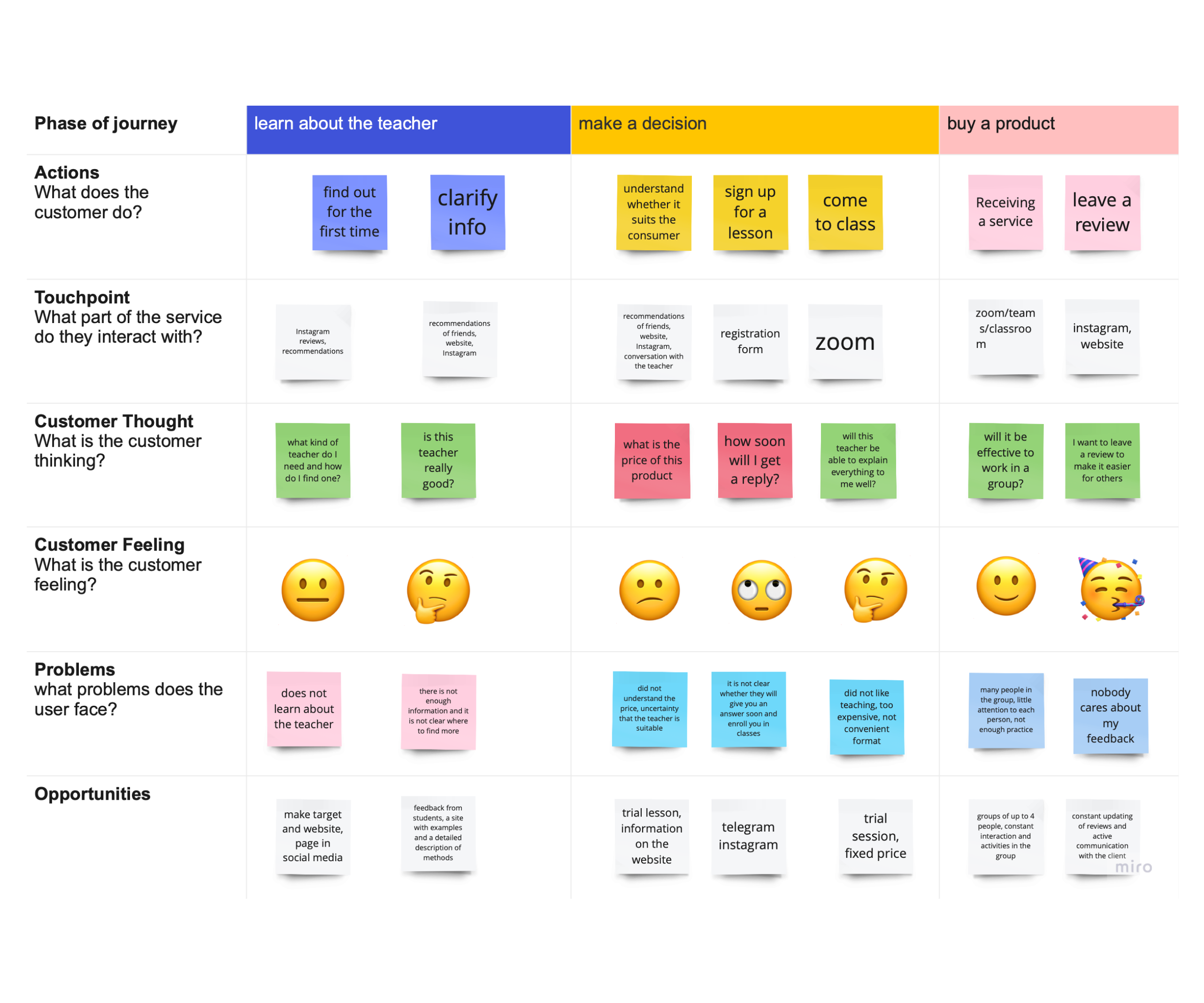
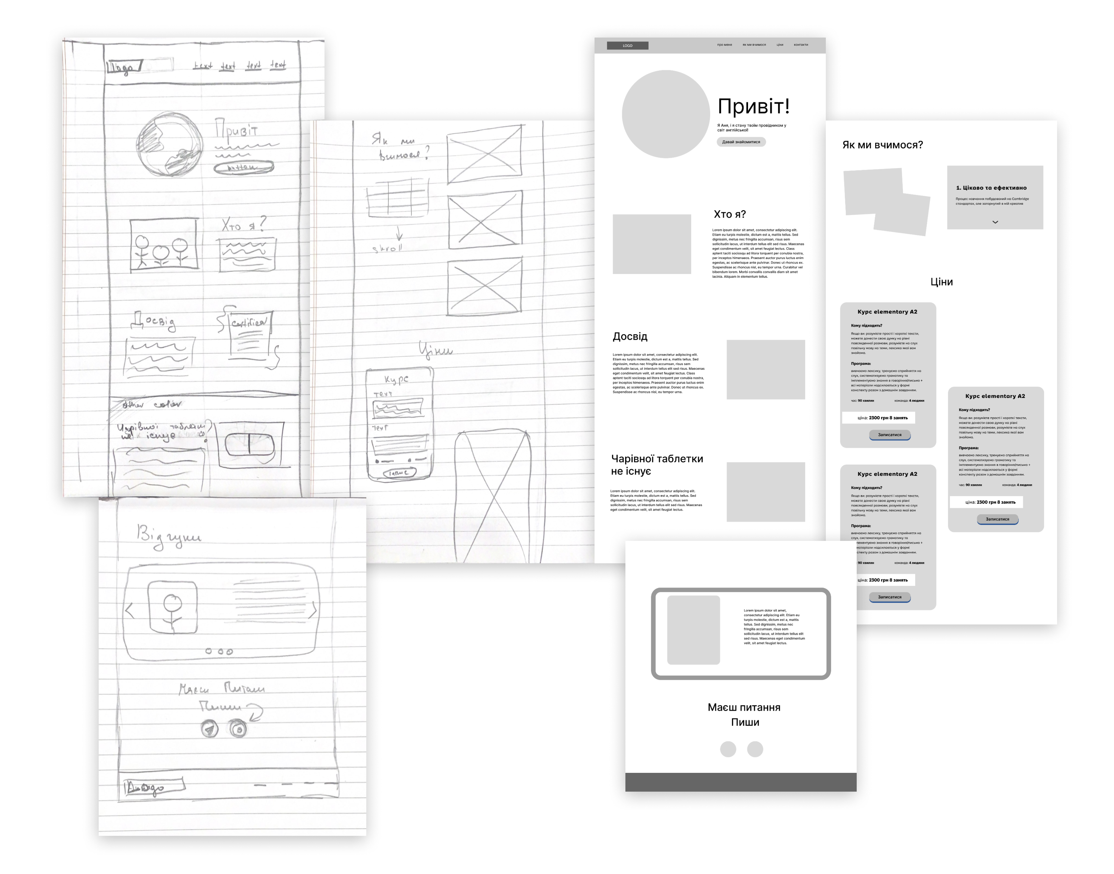
When I first started this project, I knew that it was important to have a clear understanding of what the website needed to accomplish. So, I conducted research to identify the goals of the website and the problems users might encounter while using it. Once I had a solid understanding of the user's needs, I began to sketch wireframes for the website.

To help the client better visualize the design, I then created digital wireframes and low-fidelity prototypes using Figma. This allowed me to present a clear visual representation of the site's structure, design, and functionality. Ultimately, this process helped the client to better understand the project and make informed decisions on the design and direction of the site.
Wireframes
When working on the design and prototyping of this website, I made sure to keep in mind that the interface should be straightforward and purposeful, without intricate animations that could slow down loading times. This was especially important to consider for the portion of our target audience still living in Ukraine, where internet access can be limited or slow.

Additionally, I focused on making the price cards detailed, as I recognized that during the process of exploring the product, the cost and comprehensiveness of what is included play a critical role in the user’s decision-making process. By providing detailed pricing information, I hoped to alleviate any confusion or uncertainty around what customers can expect to receive, thus increasing the likelihood of converting potential users into paying customers.
Design process
Throughout the design process, my focus was on creating a simple yet engaging website that would convey the desired mood to users. To achieve a more casual feel, I chose the "Fixel" font, which blends geometric and handwritten elements. I carried this idea through to the photo design, with small, simple illustrations that add a friendly, emotionally charged touch.

As part of my research, I conducted interviews with real consumers to better understand their needs and preferences. This helped me design with the details in mind, creating a site that truly resonates with the target audience.

Additionally, I took into account the importance of site speed and optimization, particularly for users in areas with limited internet access. As a result, I avoided complex animations and made sure the interface was simple and easy to navigate.

Finally, I paid close attention to pricing, as I knew it played a key role in the decision-making process for potential customers. By creating detailed and transparent price cards, I ensured that users had all the information they needed to make informed purchasing decisions.

Final thoughts